Goals:
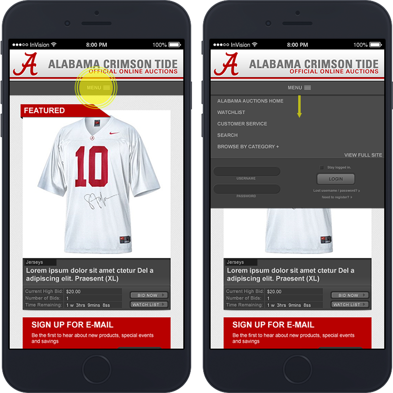
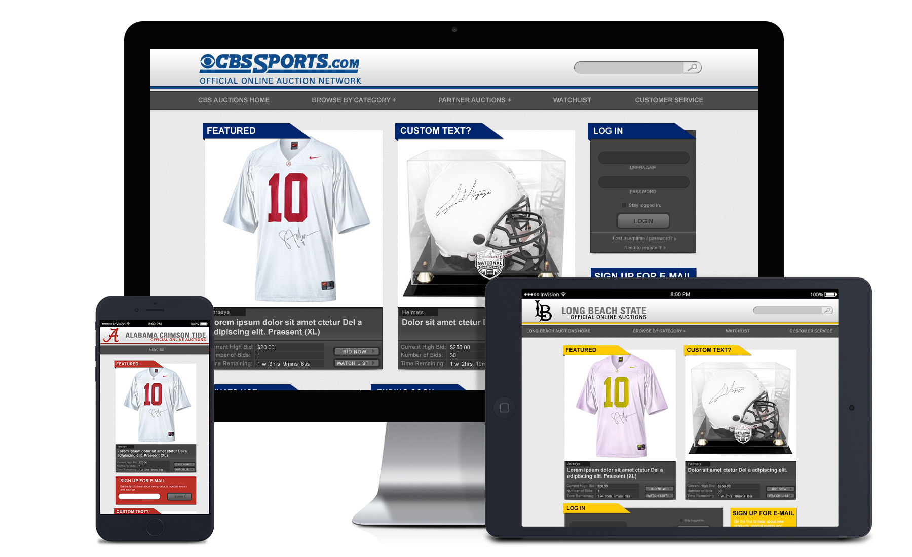
The goal was to create a long overdue mobile friendly auction website for all of CBS interactive participating partners. The old site was designed at a time when mobile user numbers were well under 15%. At the time of conception, the user numbers were surpassing 40% and rising at a fast rate each year. This made one of our top goals making sure it was responsive and easy to use across multiple user platforms. The goal was to create a long overdue mobile friendly auction website for all of CBS interactive participating partners. The old site was designed at a time when mobile user numbers were well under 15%. At the time of conception, the user numbers were surpassing 40% and rising at a fast rate each year. This made one of our top goals making sure it was responsive and easy to use across multiple user platforms.

Challenges and Solutions:
A big problem was analyzing the data to create something that would work best with all our partners. We had two areas we had to consider early on. The B2B and B2C. The most natural data to collect was B2B, our university partners who co-managed the auction sites. We were able to get direct feedback on what challenges they have had and what they would like to see changed or added. However, often the data conflicted with each other. What had worked for one university did not for another. We had to find solutions to polarizing feedback. While we did our best to create the ability for each university to customize their profile, other aspects had to conform as it was all fun on one platform. Since the primary goal was to increase sales among the consumer, we based our final solutions off of what was going to be a better experience for our personas.

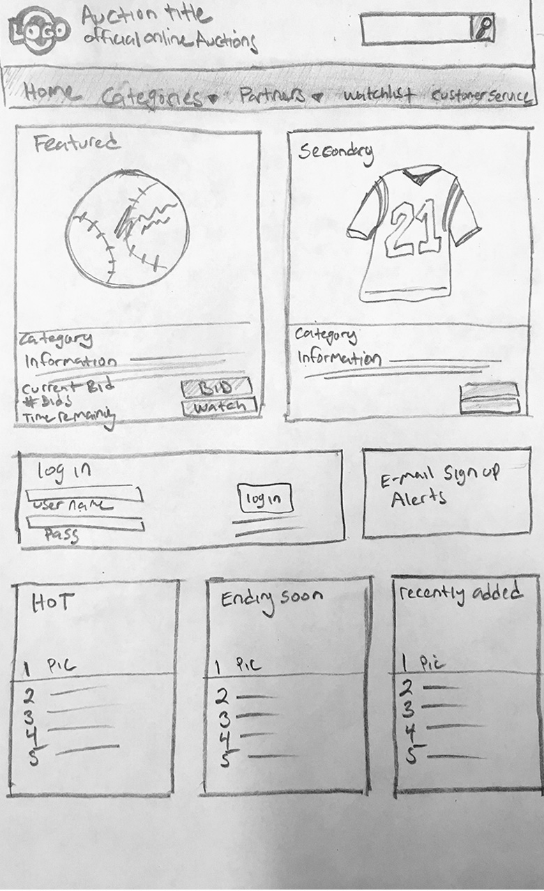
Next was focusing on the Consumer experience. The universities collected most of our user data. We analyzed the data to find who our target consumer was and worked outward from there. We found Alumni to be the largest consumer of auction products. Even though our personas, by and large, were tech-savvy, we had still attempted to cater to the lowest common denominator when possible. The newly added ability of customization was to allow each of our universities accesses to do real-time A/B testing (like button colors and text size) to aid in finding the best solution. After getting a grasp on our personas, we moved into the sketch low-fi wireframe stage. Through several pages of almost illegible rough sketches via paper and dry erase board we started to work out the kinks and get an early grasp on what we wanted the user experience to be from the first view to winning a bid.
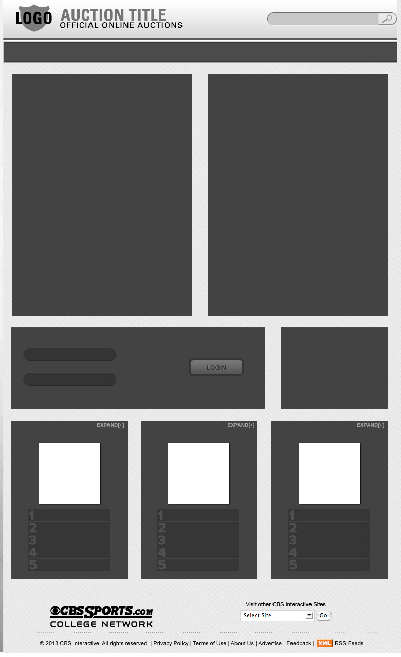
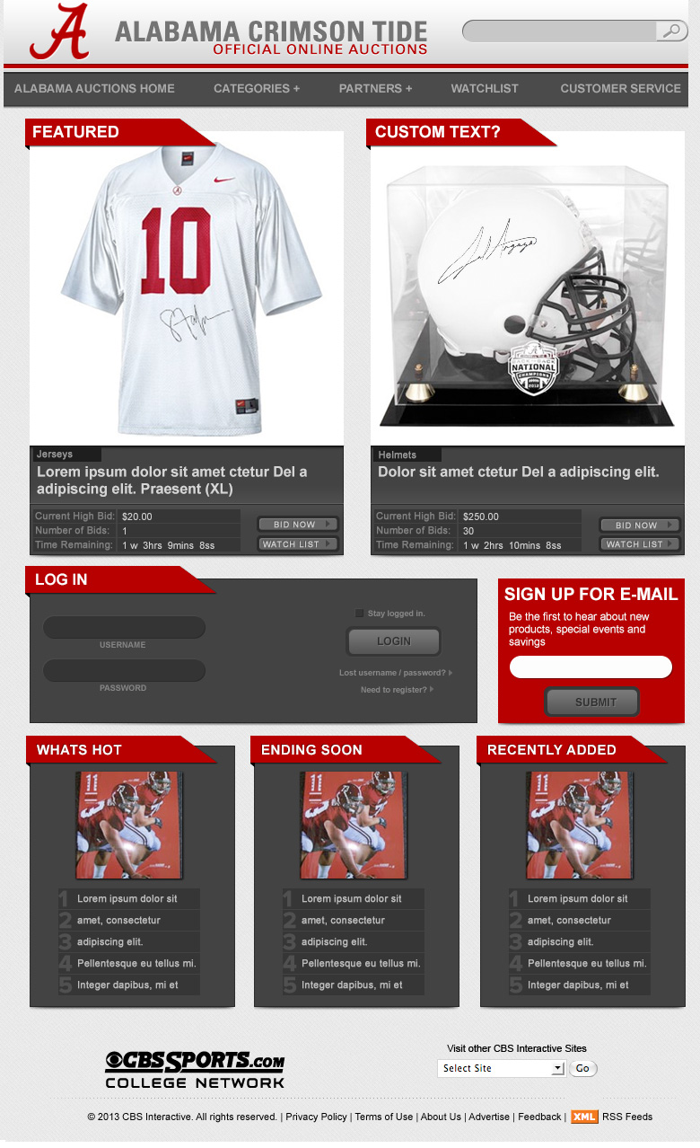
Next, it was time to put on the UI hat. Working from the earlier approved sketches I was able to create a wireframe using block spaces to help figure out the responsive layout and the sizes. Then we moved on to creating the high-fi mock with logo, photos, and color. We worked simultaneously on the breakdown sizes since most of the work was hashed out during the sketch phase.
The final stages were designing all the interface components like dropdowns and buttons. Then compiling them into style guides and mock-ups for the developers to build the site out.