The Process
Kick off call notes
Objectives
During the kick-off call, the client stated they wanted a “clean site” with each section “visually easy to find.” They wanted to “clean up the clutter" from the previous design. Citing “efficiency” as a keyword. They were looking to maintain a light theme using a majority of white with their green color as the primary accent. High priorities were to push video content and help increase traffic to their online store.
Challenges and Solutions
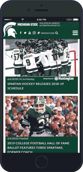
While mobile has become the increasingly favored device for browsing the internet, MSU's user stats at the time of the kick off call had a higher desktop percentage. Because of this, we started with the desktop index page to mock up first.
As with any content-heavy websites, there are always challenges with space and placement. Between MSU and CBS Interactive, each respectively have their requirements and requests for content that needs to be on the index page. An early obstacle became placing two of the three ads contractually required by CBS around MSU’s requirements and remain optimized for viewability. To meet CBS Interactive standards, an ad has to be 970 pixels and above to be considered optimized as in-view. The preferred optimized ad combination with the best success rate of conversions is a leaderboard and story ad. Designing around the contrasting shapes creates a challenge within a responsive website. After a few iterations and some compromises, I was able to fit the leaderboard below the main stories and place the story ad in the next section below while staying within guidelines.
Low fi mock up ideas
With the high priority of video, I created two of the photo story spots with a 16:9 ratio. Doing this would allow a video story to play in place. Their online store was the next item we needed to promote higher on the page. The solution was to split the last story in half. Converting the new spot on the right to a store promo and the tertiary story on the left. Since the tertiary story was no longer 16:9 video ratio we came up with a solution using a modal overlay when played. To assist their video hits, we added a dedicated video player where users could cycle through all their free branded videos.
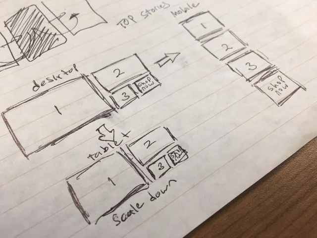
After the index was tied down and approved by all sides we moved on to the responsive breakdown sizes. I was able to produce the breakdown mock ups rather quickly as each section was always in consideration for how it would size and stack during the desktop design. Like many previous site designs I had created low fi mocks to resolve any issues. Over all we would create four index mock ups. Desktop HD , Standard desktop, Tablet and Mobile.
INDEX
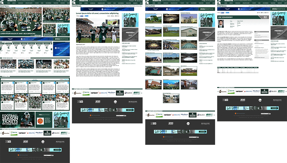
Interior Pages. Sports, Story, Non Sports and Bio Page.