Website Redesign
Client: Jenny Craig
Project: JennyCraig.com website redesign
My Role: UI/UX Designer , working with a team of 3.
Overview: Jenny Craig is a premier weight loss company that provides personalized support to help members lose weight. The program comprises a custom one-on-one support and guidance from a weight loss coach weekly as well as over 100 menu items crafted by the company's chefs. Jenny Craig's website plays an intricate role in bringing in new clients and assisting current members along their weight loss journey. I worked collaboratively within a talented design team of 3 implementing user experience (UX) and user interface (UI) while working closely with the new CEO David Pastrana to develop and implement his vision for the company.
UX Design Process
Specific Tasks
Navigation
How it Works Page
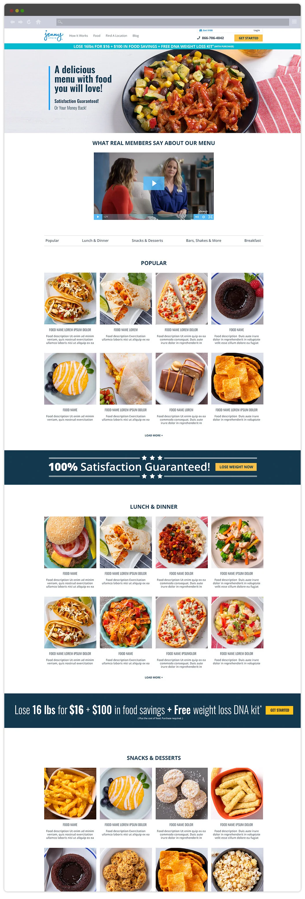
Food Menu Page
Success Stories Page
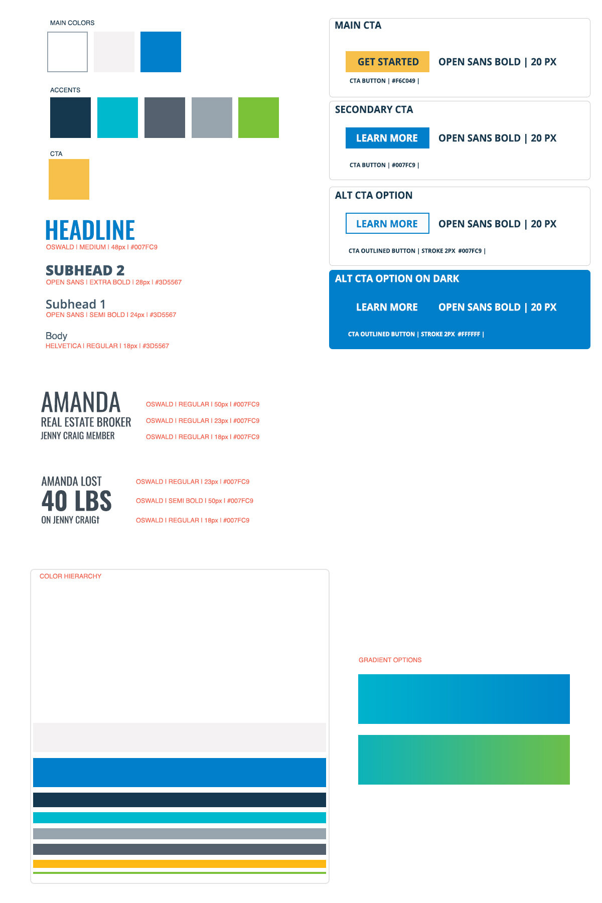
Style Guide
Challenges
The biggest challenge we face by far was the quick turnaround for the project. Jenny Craig was launching a significant new tv campaign to pull in a lot of new users. There was a lot of pressure to have the redesign launch coincide with the new campaign. We received the green light in early January with a deadline at the end of February. Since this was two months less time than initially expected, it was imperative to create a realistic timeline for us to get out an MVP (Minimum Viable Product). Our next challenge was to streamline the user's web experience by cleaning up and removing bloated content. The old website had become Frankenstein's monster as various departments executed single page revisions over the years. Without any concern for the overall user's journey, this made an inconsistent experience throughout the website.
Specifically, for all the tasks that I had ownership of, the "how it works" page was one of the most important. Outside of the index, it was the second-highest page viewed. It is often used as a landing page to educate users sent from digital mailers, social media, web ads, as well as various pages throughout the website. The primary function of the "how it works" page is to educate the user about the product to feel confident enough to make an appointment. Through previous testing and user feedback, we had found it was doing anything but educating the user. Most of the results showed they were no more informed if not confused about how Jenny Craig Worked.
Solutions
Along with creating a feasible timeline to navigate the tight deadline, we divided the tasks amongst the team by pages. Setting up multiple meetings a day to go over revisions ensured the overall design remained cohesive, which helped keep the project on track. Working with the web analyst, we gathered data from the previous website to assist in our redesign. We identified the content to carry over that resonated best and fix or remove those that caused pain points with users, allowing us to reduce a lot of clutter. While we could not conduct new interviews with clients due to the tight deadline, I met with the Director of Contact Center Operations. They had been collecting a plethora of website feedback when talking directly with clients. A majority of issues dealing explicitly with the "how it works" page. With this meeting, I quickly learned the previous iteration was supplying bloated information causing a user to have to search around often getting more confused in the process. I was able to fix this by breaking down the content hierarchy based on demand. Then working with a copywriter to get more streamlined user valuable content. Using photos and icons to help break apart and identify each subject, I made the page easier to scan and more accessible for pertinent material. By doing so, we saw a steep increase with users making appointments.
Results
The early results have proved to be successful. With the launch of the new tv ad campaign, we saw an increase in conversions with less drop-off. Customer service said they had received fewer calls about issues related to the website. Early comments were also positive on the "new cleaner website."
Updated Results: A little more than a month and a half after the launch of the website, the Covid-19 pandemic struck, causing a plummet in sales and website activity. With these unprecedented events, there currently is no previous similar base data to compare with how the website should be performing under the circumstances. Reviewing the affected limited stats to create a working theory, we believe finishing the redesign before the pandemic has had a significant positive effect helping current members continue with the program in these difficult times despite the overall loss of new sales.
Style Guide
Redesigned Navigation
How It Works Page | https://www.jennycraig.com/how-it-works
Menu Page | https://www.jennycraig.com/food-menu
Success Stories Page | https://www.jennycraig.com/success-stories


