
Appointment Funnel
Client: Jenny Craig
Project: Design a new improved appointment funnel.
My Role: Lead UI/UX designer , research
Timeline: December 2019 - February 2020
Overview: The appointment funnel is an essential online step that helps connect prospective clients and returning members with a Jenny Craig weight loss coach. Potential clients that end up talking face to face with a consultant have a 70% conversion rate of becoming a member. It is even higher for returning members to sign back up. Our goal was to build a new funnel that would allow users to seamlessly schedule an appointment with a weight loss coach at their local Jenny Craig center.
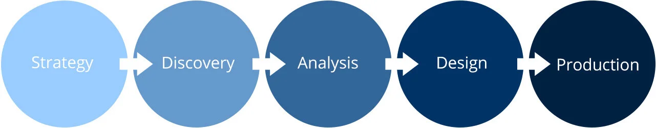
UX Design Process
challenges
We needed to streamline the process to decrease the overall 95% bounce rate by identifying our user's needs to improve conversions. While in the discovery phase, we set out to find the main problems with the old funnel. One of the most significant issues that caught our eye was the 80% bounce rate after just the first step. Next was to clean up distracting, irrelevant graphics. Several graphics were used within the old funnel throughout each stage to inform users about the weight loss programs. I hypothesized that it was doing more harm than helping by making an inconsistent experience between each step and distracting from the users' end goal.
SOLUTIONS
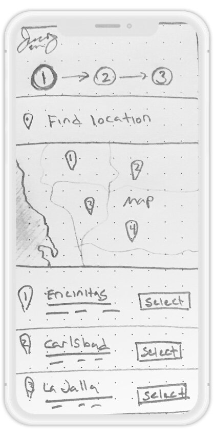
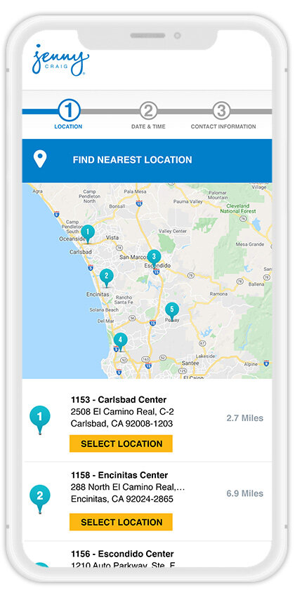
Our solution was to challenge the previous flow of the appointment funnel. We arranged the steps into a new order that made a more fluid experience. I empathized that most clients were just curious to see if there was a location and or time that would work for them. Previously, when asking for their contact information in the first step, they felt pressured to commit before obtaining the information they wanted and would leave. Through testing and the final product, we saw a significant increase of users follow through by placing the contact information as the last step. We were then able to streamline the funnel down to just three steps by adding geolocation tracking and improved edit features. Finally, we made the funnel a simplistic design that was a distraction-free experience by eliminating graphics that would confuse the user. If these graphics were somehow relevant to the user, we failed to educate them properly before entering the funnel. As a result, we expanded the project beyond the funnel by adding the proper information and graphics to entry points that informed the user before entering—in conclusion, allowing the user to schedule an appointment hassle-free.
IMPACT
During our discovery phase, we had consulted with a 3rd party analytics specialist to quickly gather comparative data we could use for correlation in our redesign. The consultant suggested that by fixing our issues, we should see at least a 5% increase in conversions. We saw an incredible 20% increase. By cutting down the number of steps and removing the clutter, we successfully streamlined the process and saw an increase in conversions.
Appointment Funnel Flow Chart


Conversion Charts


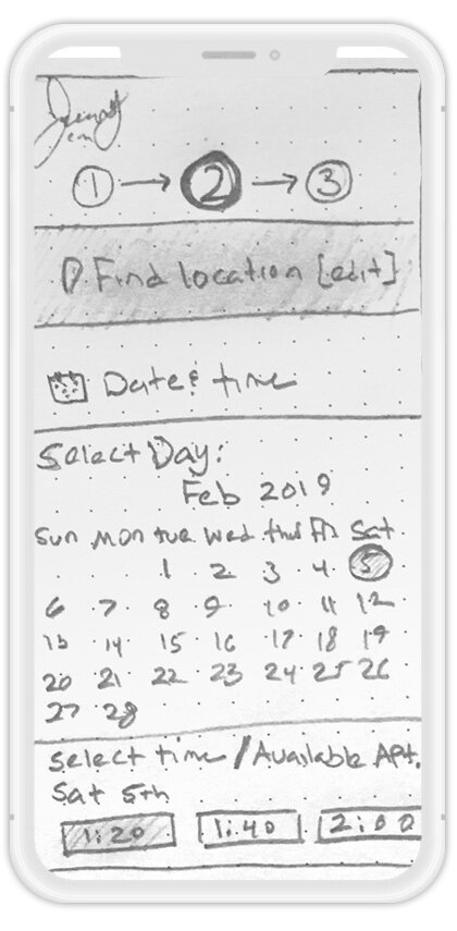
Mobile Designs


Desktop Designs

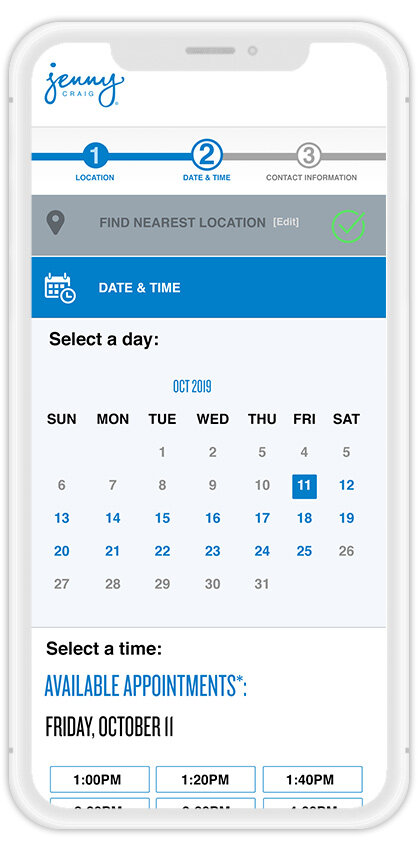
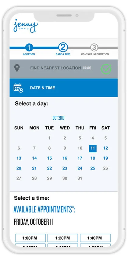
Step 2: Date & Time | A new updated calendar was added that displays real time available appointments to choose from.
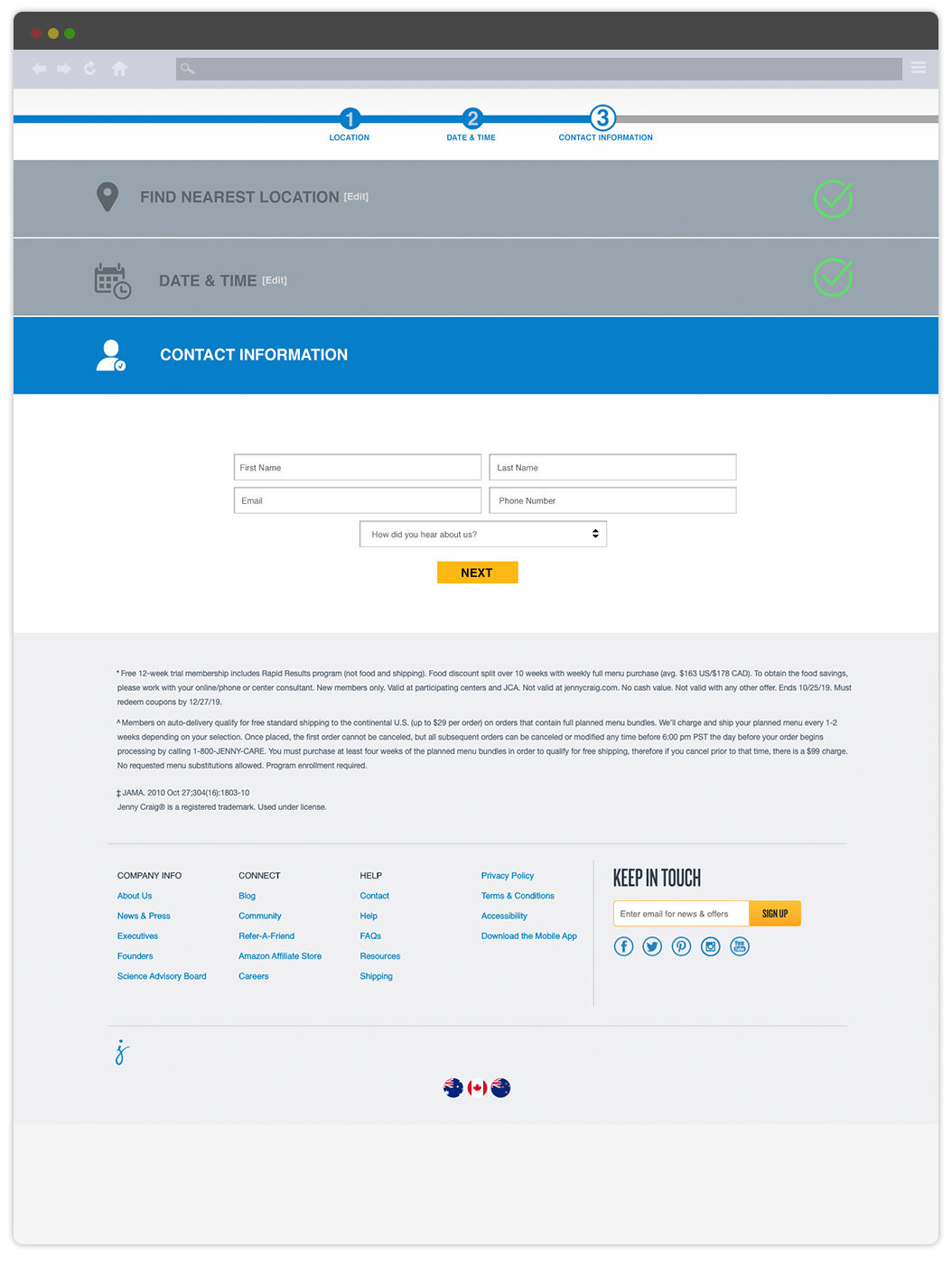
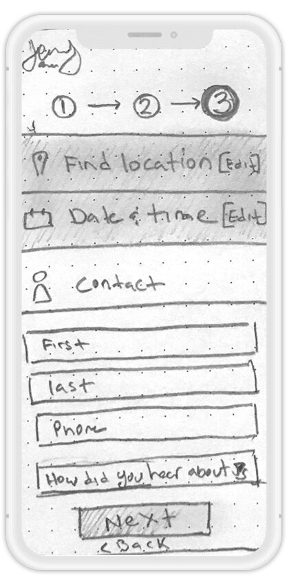
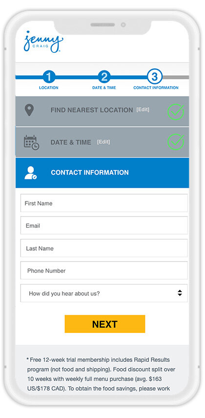
Step 3: Contact Information | Moving the contact page to the last step allowed curious users to see if there was a date and time that worked for them before giving away their information. This move helped increased conversions by 20%.